New UI Changes
July 25th 2019
What’s new?
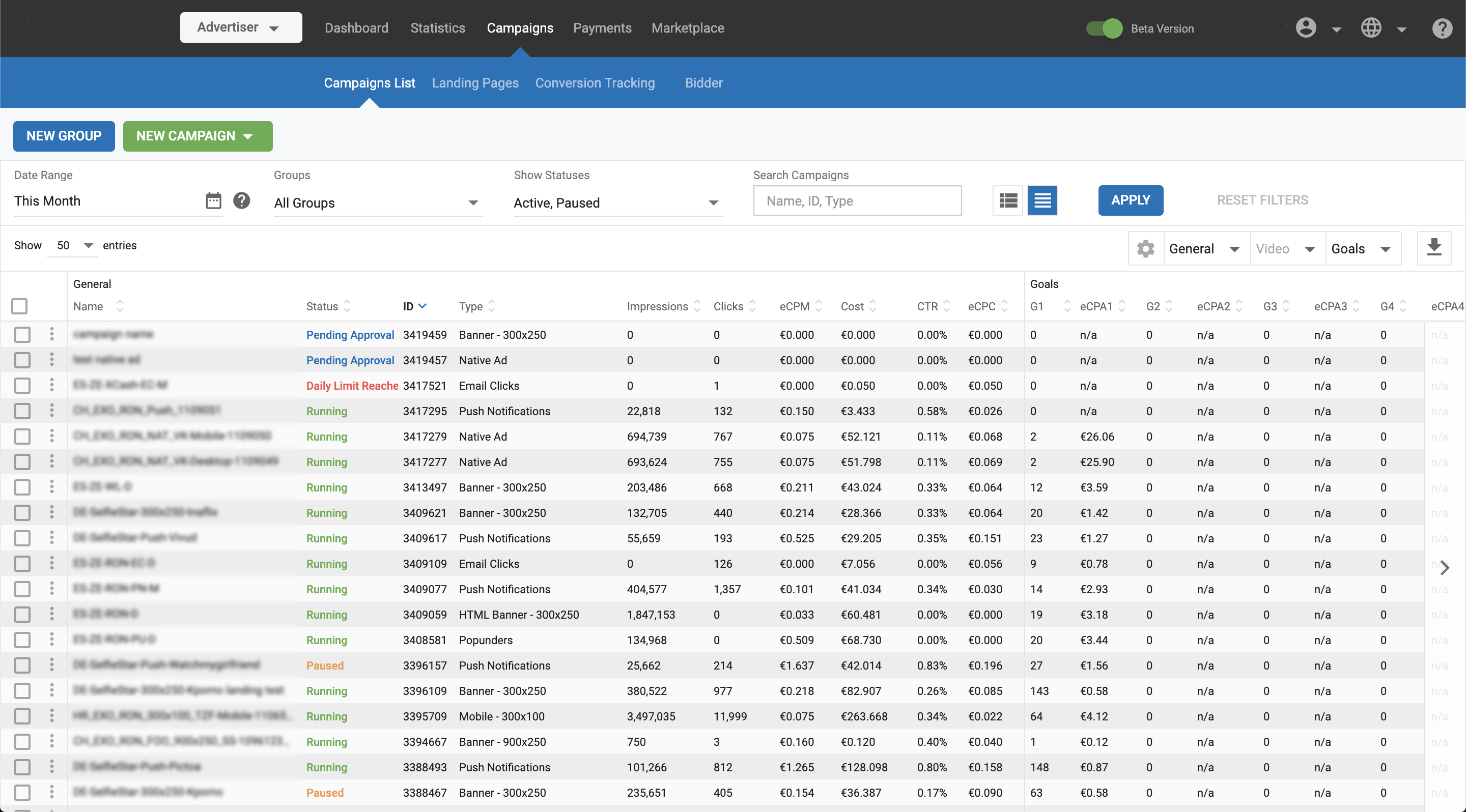
We have made some changes to the CSS styles in all screens to reduce the content size and spacing, which enables more information to fit on to the screen at the same time. We have also reduced padding in cells of all tables, so that more data can fit in them horizontally.

What can this new feature do for me?
These UI changes enable you to fit more data on to the screen at any one time, reducing the need for horizontal scrolling. This will improve your workflow when working with the Admin panel and make it easier for you to get insights into your data.
Details
The font size and padding in the tables have been reduced, making it easier to fit more information both horizontally and vertically in all pages showing table data. For example, when viewing the statistics page on a 13-inch laptop, previously you could see approx. 21 rows of data, now, you can see 30 rows giving a nearly 50% increase, significantly reducing the need for scrolling.
Similarly, more information now fits into the Campaign List, Marketplace, Payments, and Site & Zones pages.
The fonts sizes and weights used across the application have also been standardized, giving a more consistent look and feel.
When creating or editing items such as campaigns, sites and ad zones, the smaller font sizes and spacing allows you to view more of the detail and options without scrolling.
Demo video
Please view the video to see a demonstration of these changes.
