Native Ads Changes
Jun 30th 2020
What’s new?

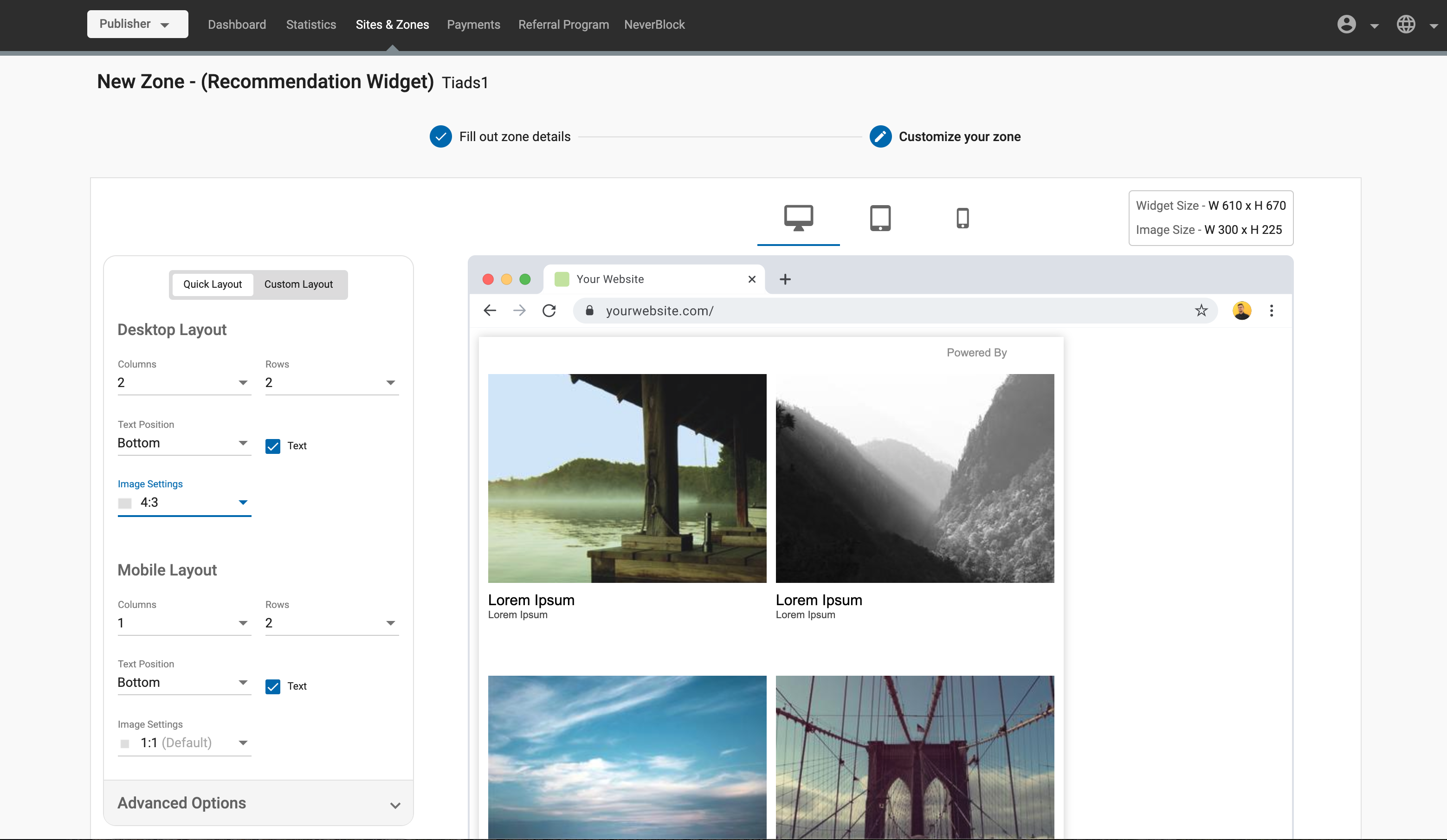
As a Publisher, the whole process of setting up Native Ad zones has been made simpler, allowing you to set them up independently for desktop and mobile formats, and see an exact preview of your ad zones on three different screen sizes.
What can this new feature do for me?
As a Publisher, this feature will make setting up Native Ads much easier and ensure that the ads display well on desktop and mobile screens.
Details
Overview of changes
As a Publisher, when creating a Native Ad zone:
- You can now select to set up your ad with either a Quick Layout or a Custom Layout:
- Quick Layout: You set the grid size and the image aspect ratio. The widget will be sized automatically.
- Custom Layout: Allows you to specify the widget size.
Whichever layout you choose:
Ads can be set up independently for desktop and mobile screens, meaning you can tailor the settings independently for each screen size.
A different preview shows for each of three screen sizes, Desktop, tablet and phone. Each preview reflects exactly what you will see when the site displays on that device.
You can choose how many rows and columns of ad there are in the native ad zone, for both desktop and mobile independently.
You can set the aspect ratio for the images, from 1:1 to 4:3, to 16:9, or a custom size.
You can choose where the breakpoint is between desktop and mobile views.
- If set to medium, the breakpoint will be between desktop and tablet.
- If set to small, the breakpoint will be between tablet and phone.
You can now set the images in ads to Enlarge on Hover, which makes the image zoom in slightly when the user hovers over it.
